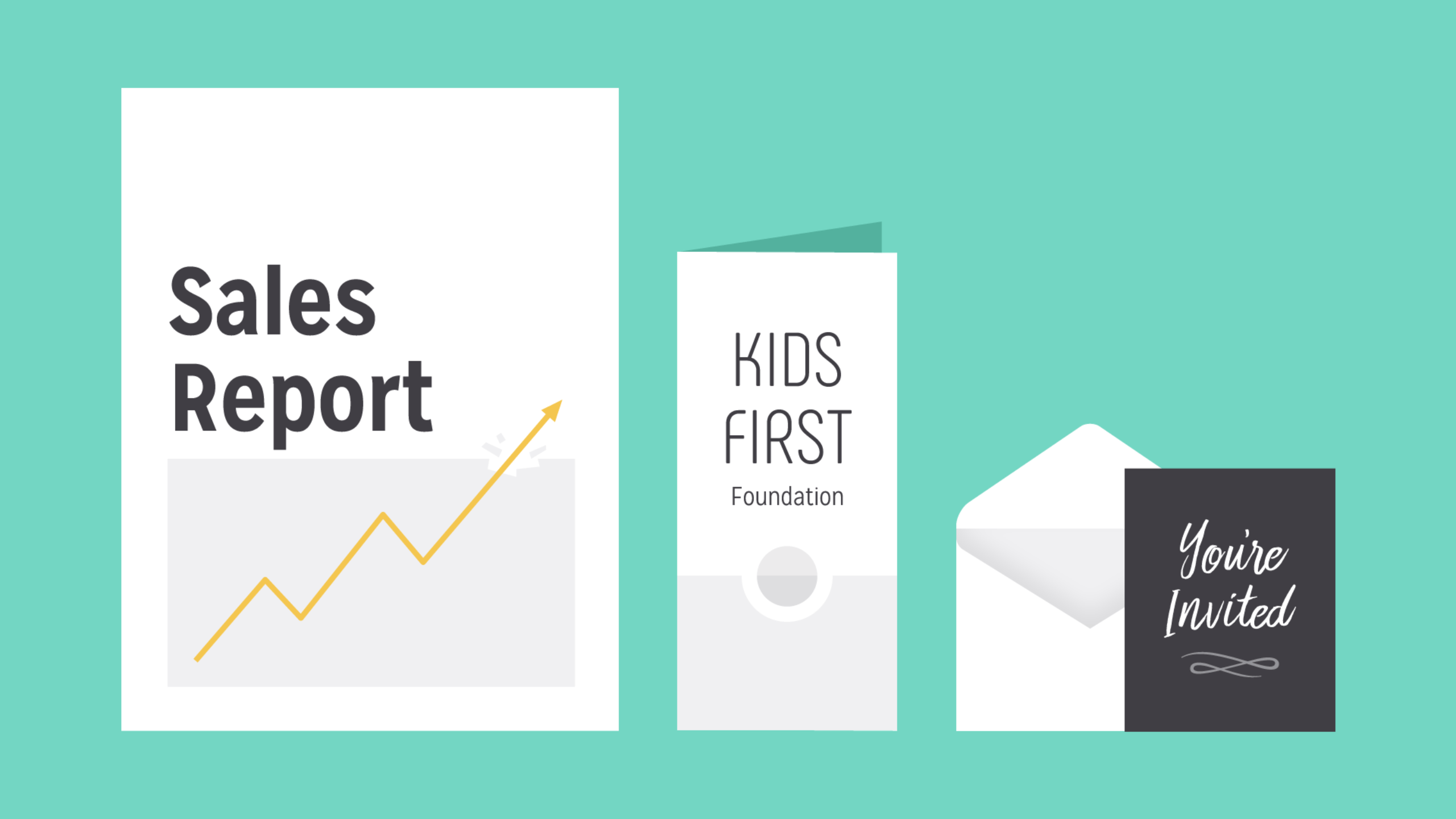
What is typography?
Typography is everywhere we look. It’s in the books we read, on the websites we visit, even in everyday life—on street signs, bumper stickers, and product packaging.
But what exactly is typography? Simply put,typography is the style or appearance of text. It can also refer to the art of working with text—something you probably do all the time if you create documents or other projects for work, school, or yourself.
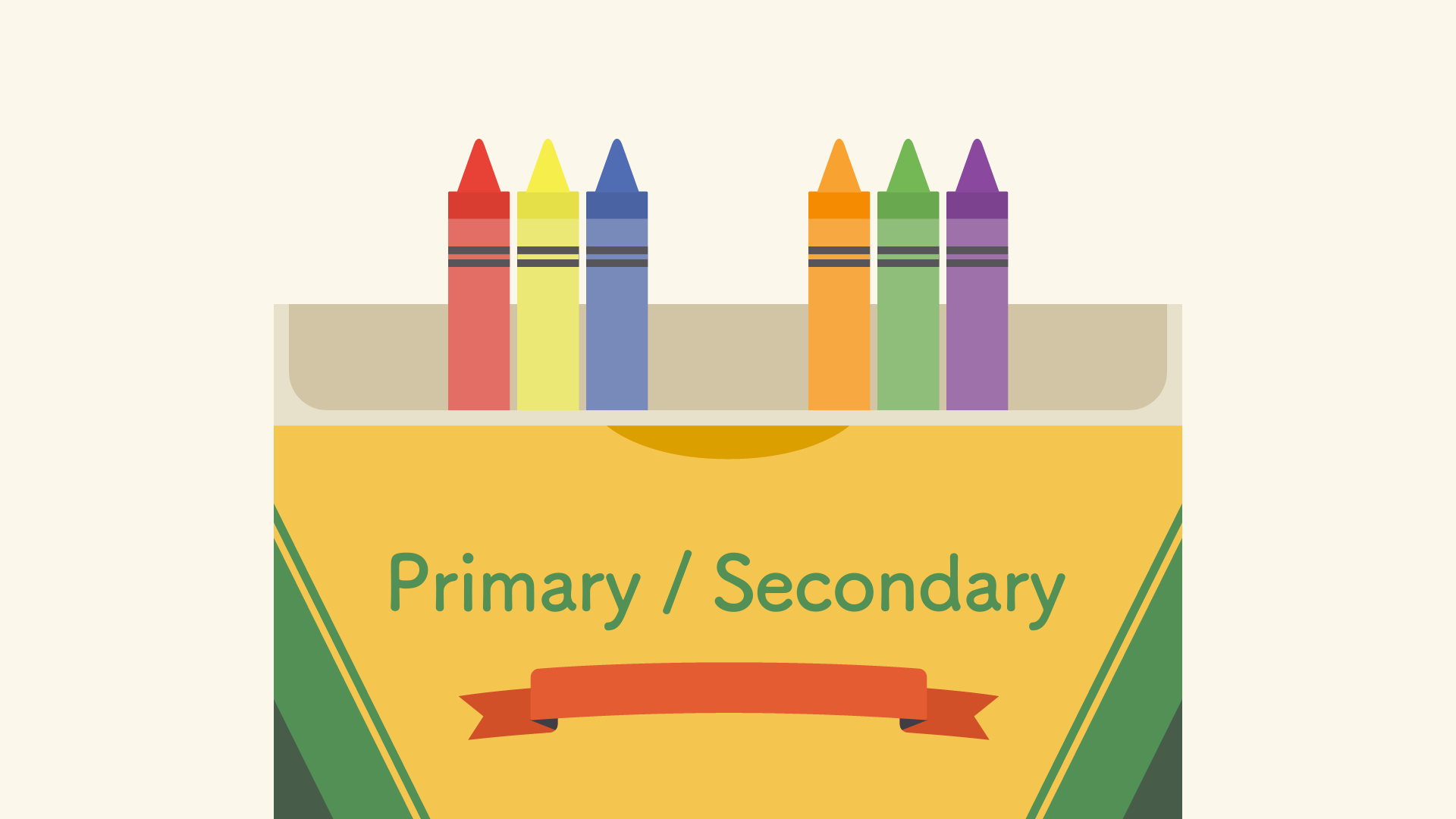
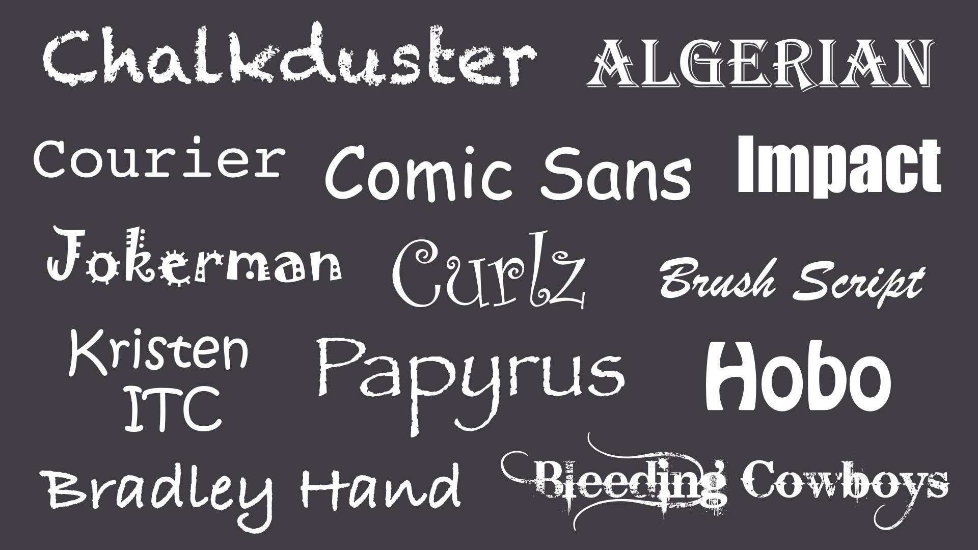
Common types of fonts
Typography can be an intimidating subject, but it doesn’t have to be. You only need to know a little to make a big difference in the stuff you do every day. So let’s get started. First, somecommon types of fonts and what you need to know about them.
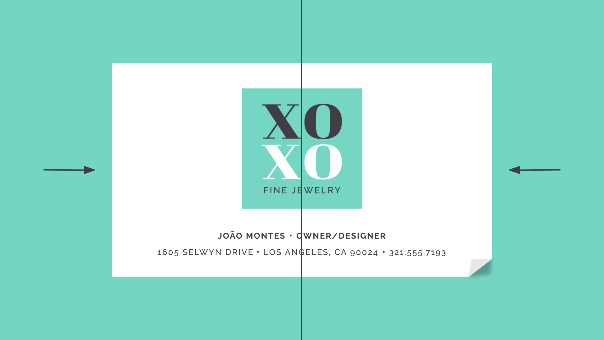
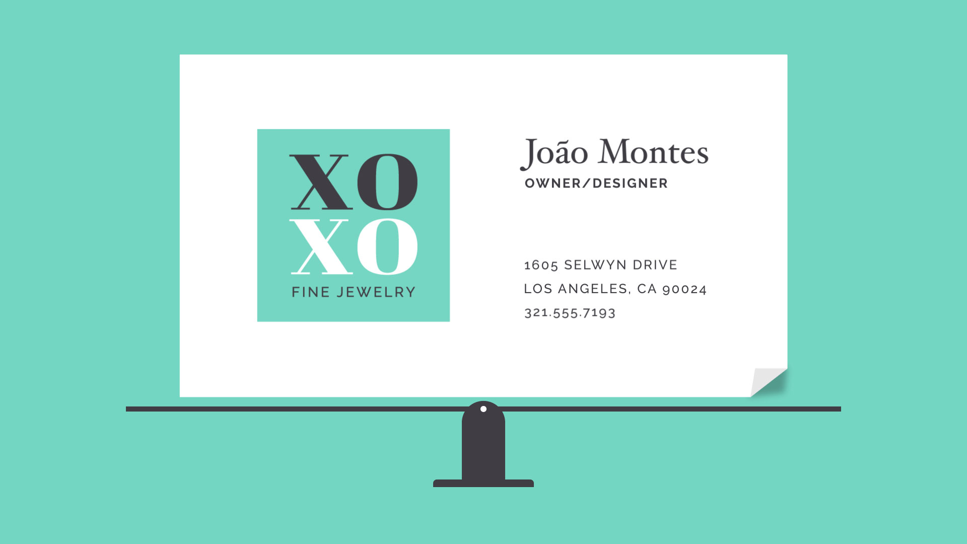
Serif fonts
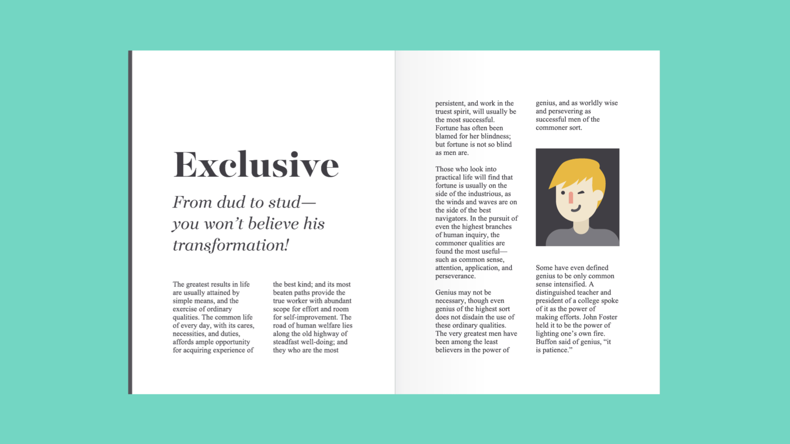
Serif fonts have little strokes called serifsattached to the main part of the letter.
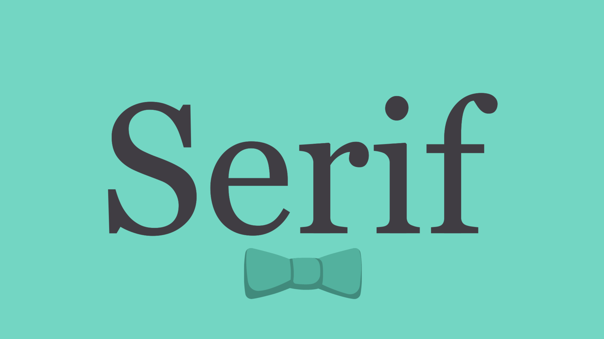
Because of their classic look, they’re a good choice for more traditional projects. They’re also common in print publications, like magazines and newspapers.
Sans serif fonts
Sans serif fonts don’t have that extra stroke—hence the name, which is French for without serif.
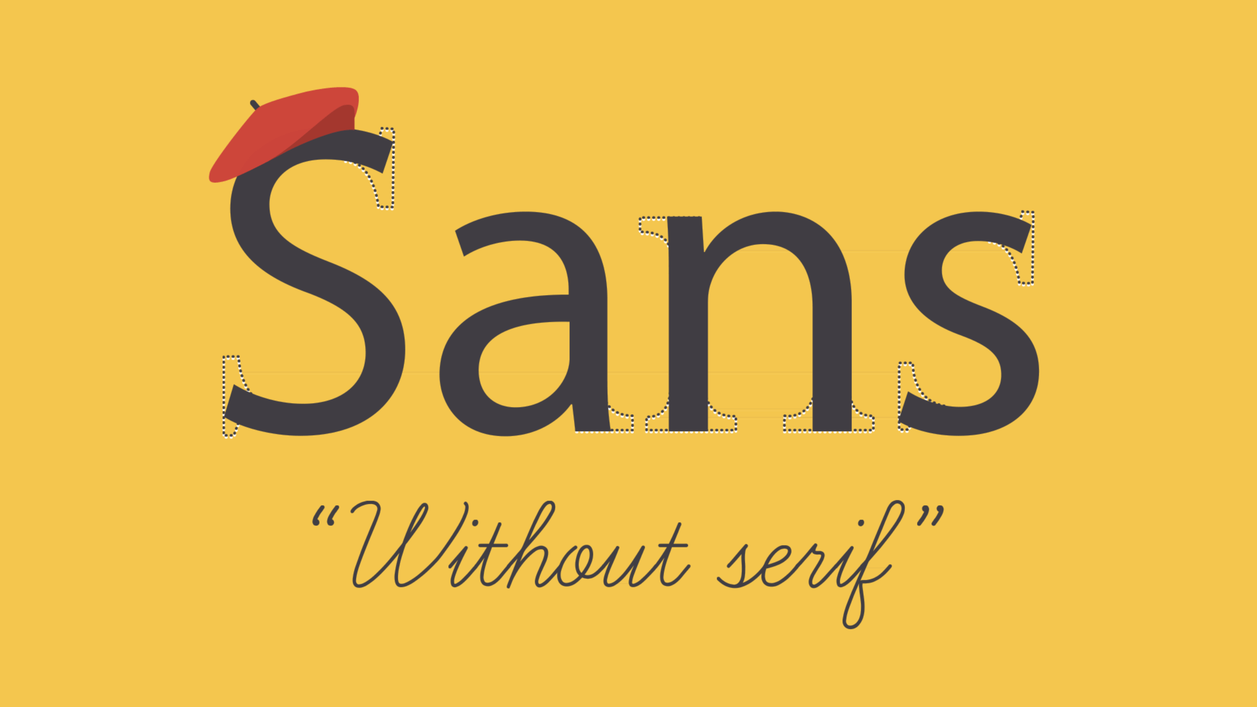
This style is considered more clean and modern than serif fonts. Also, it tends to be easier to read on computer screens, including smartphones and tablets.
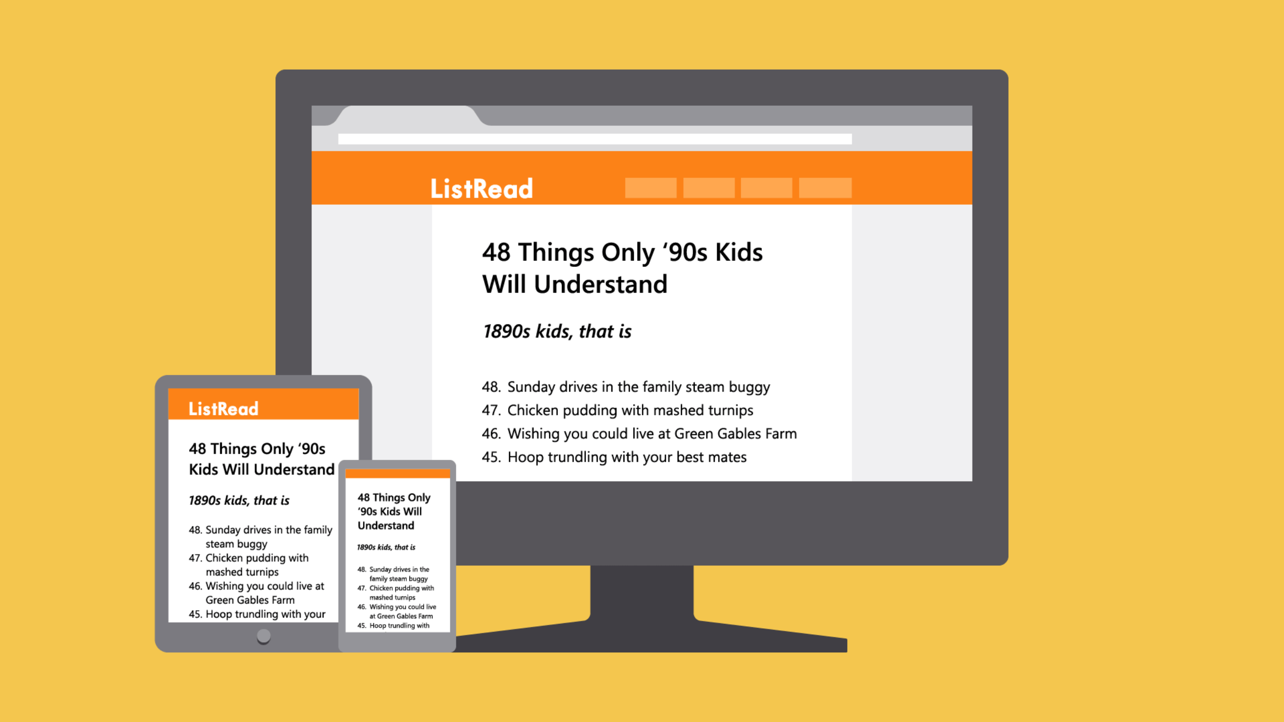
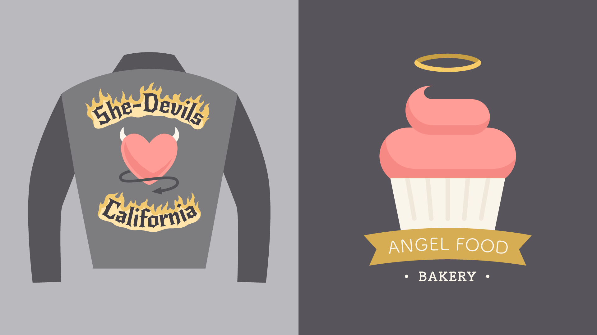
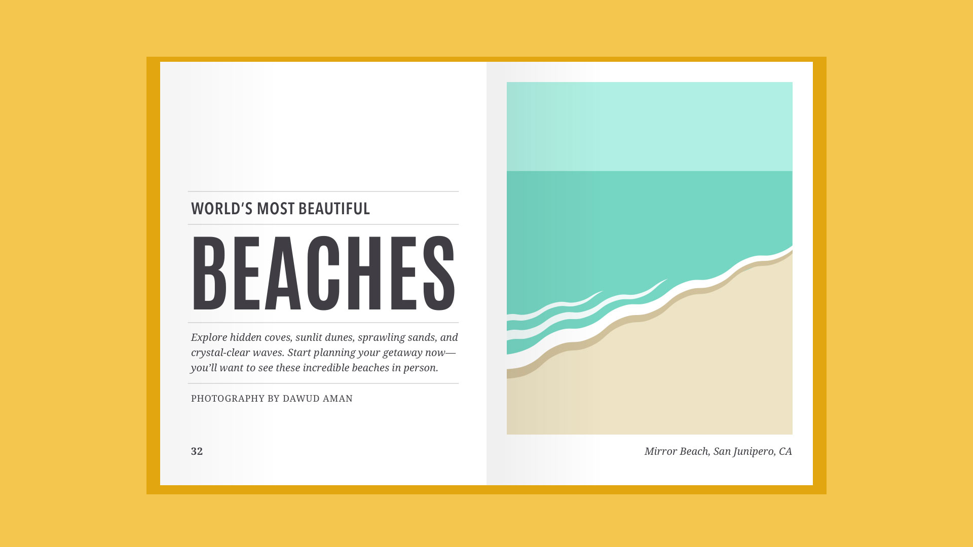
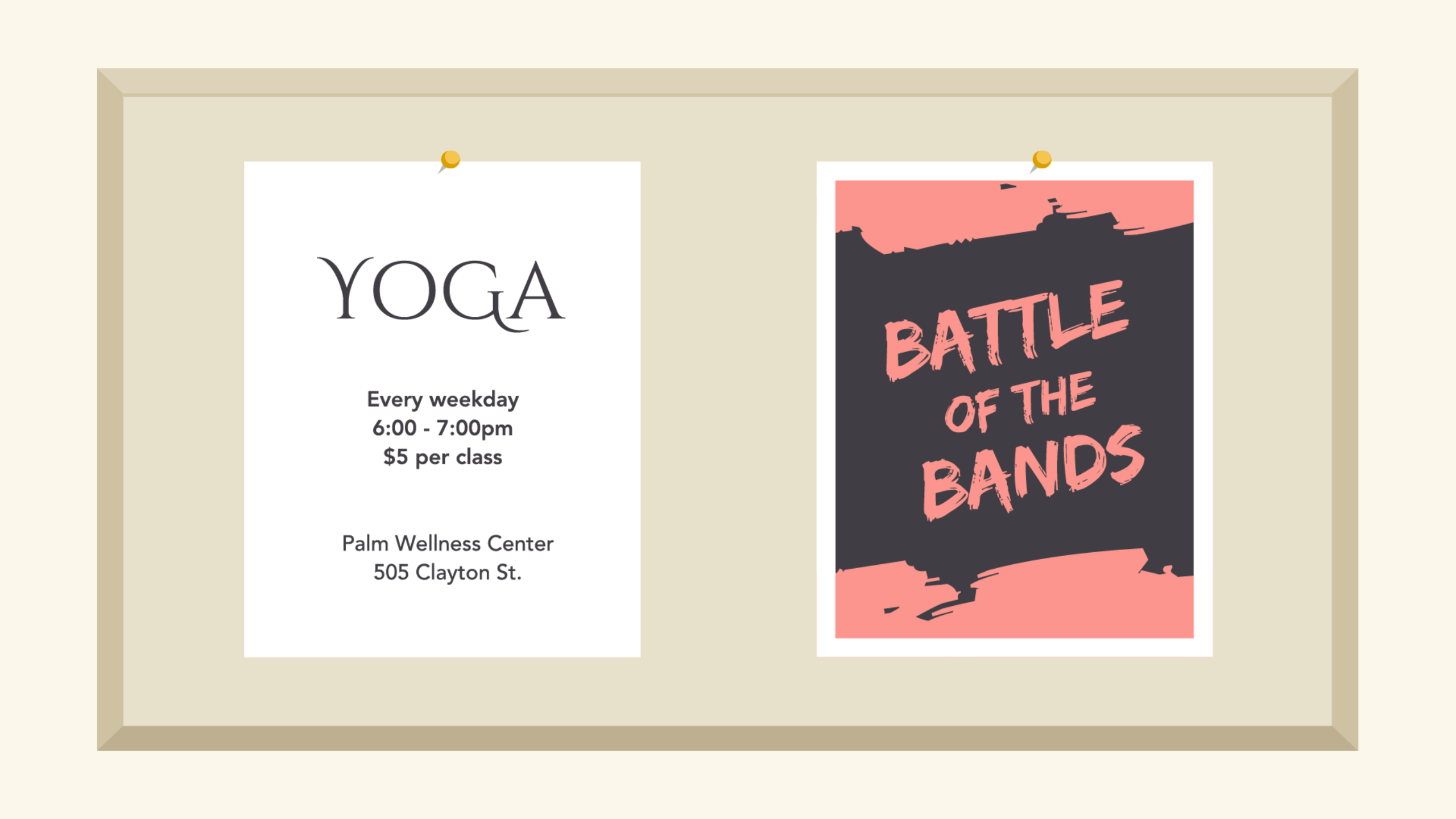
Display fonts
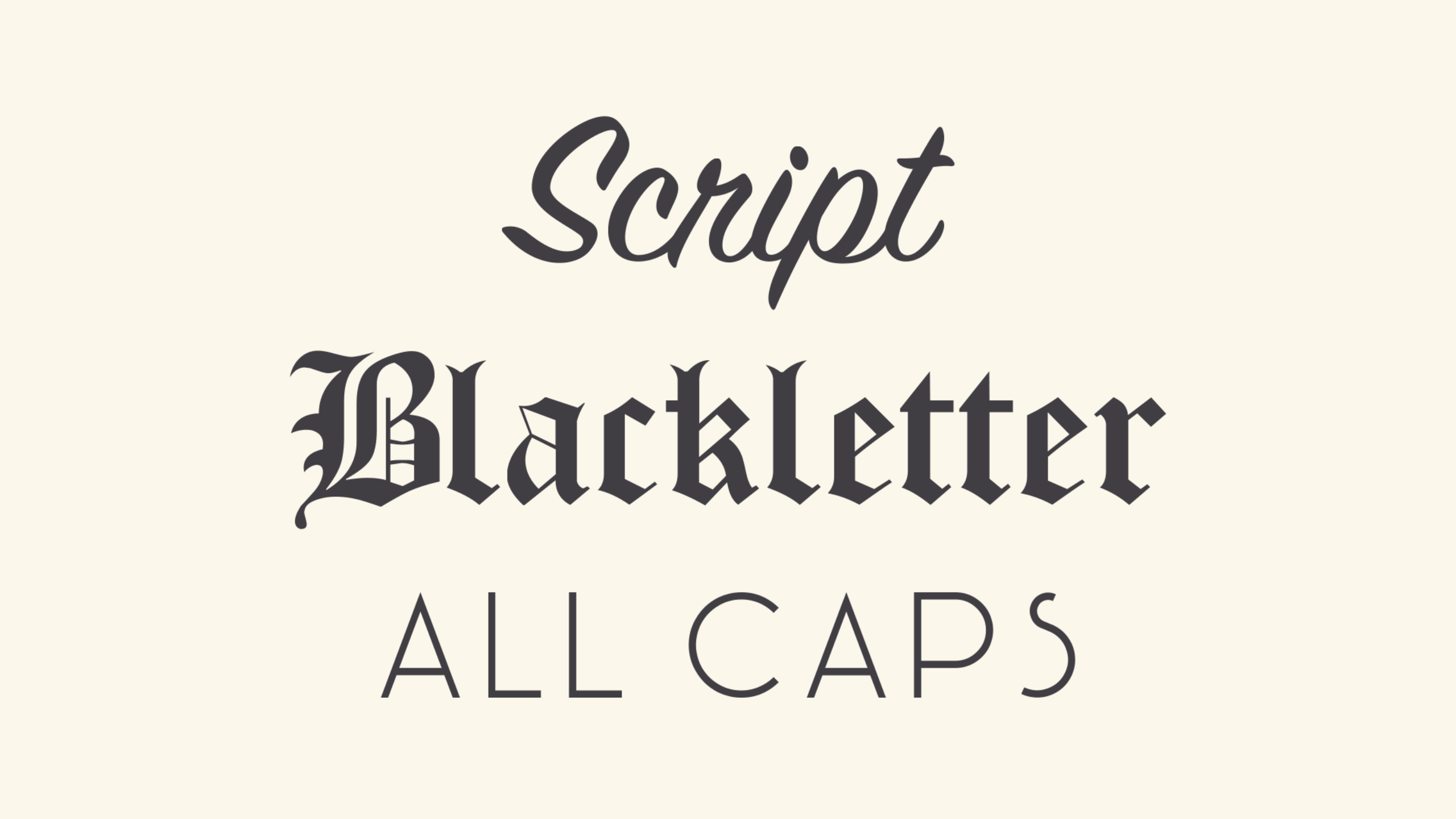
Display fonts come in many different styles, like script, blackletter, all caps, and just plain fancy.
Because of their decorative nature, display fonts are best for small amounts of text, like titles and headers and more graphic-heavy designs.
Choosing a font
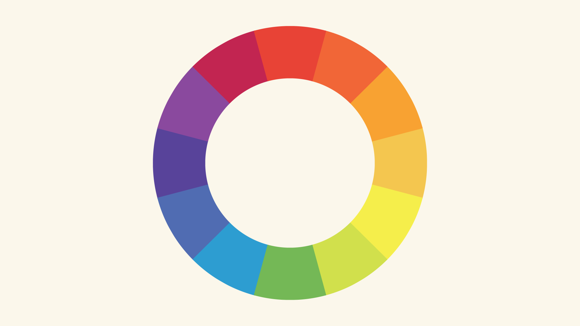
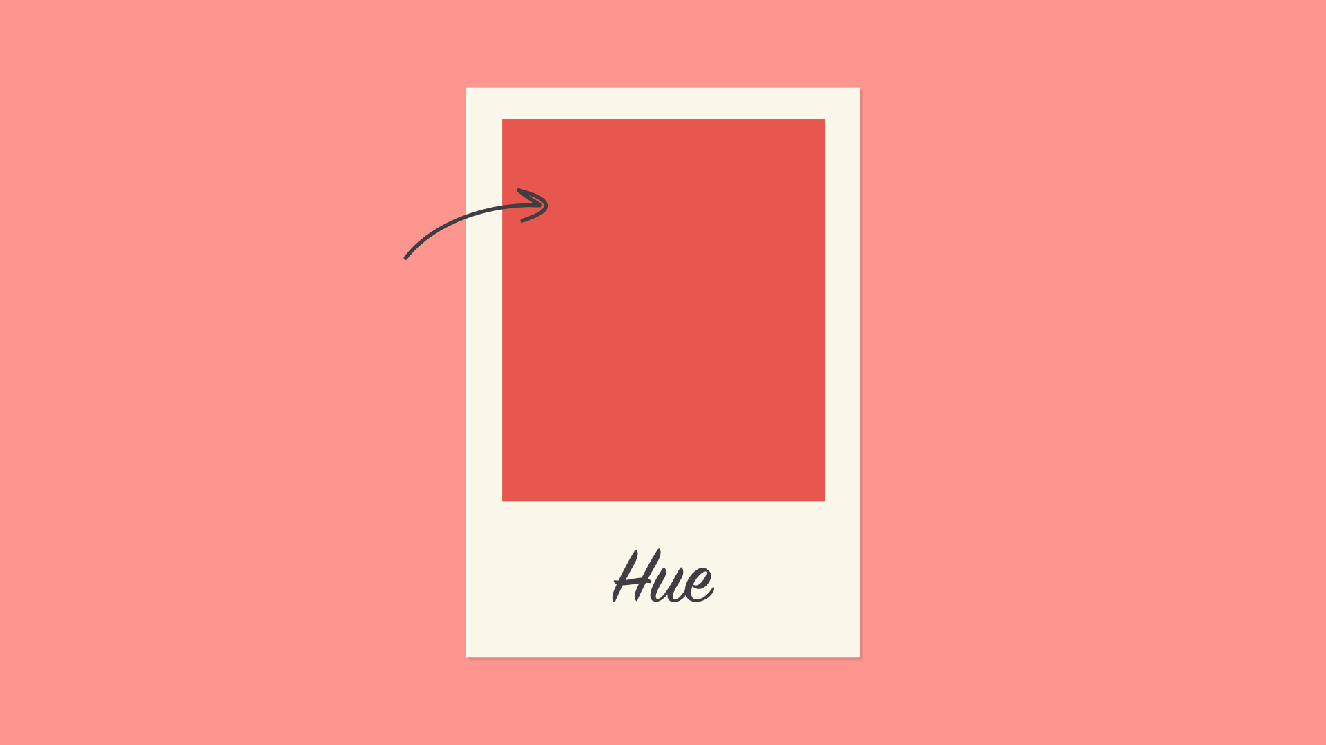
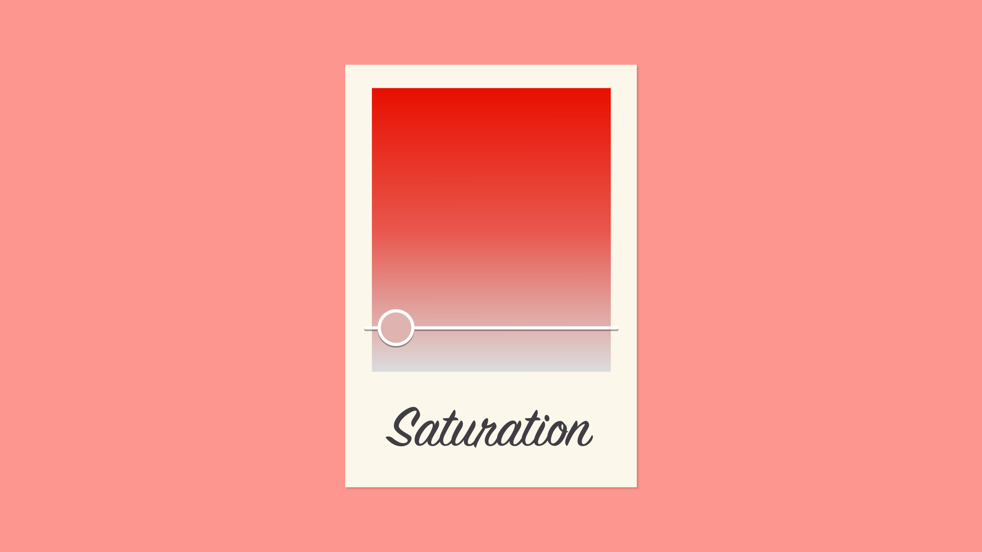
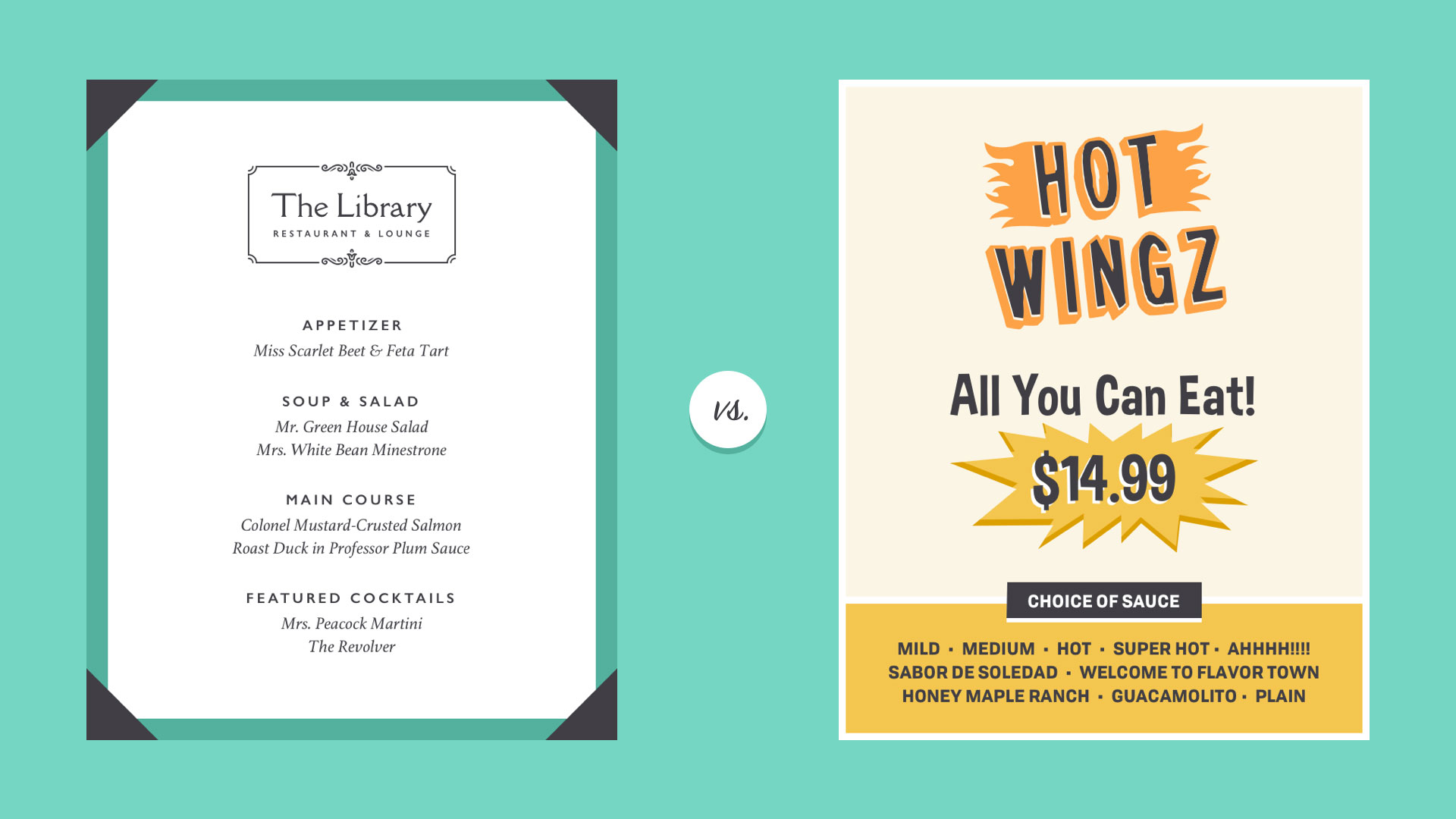
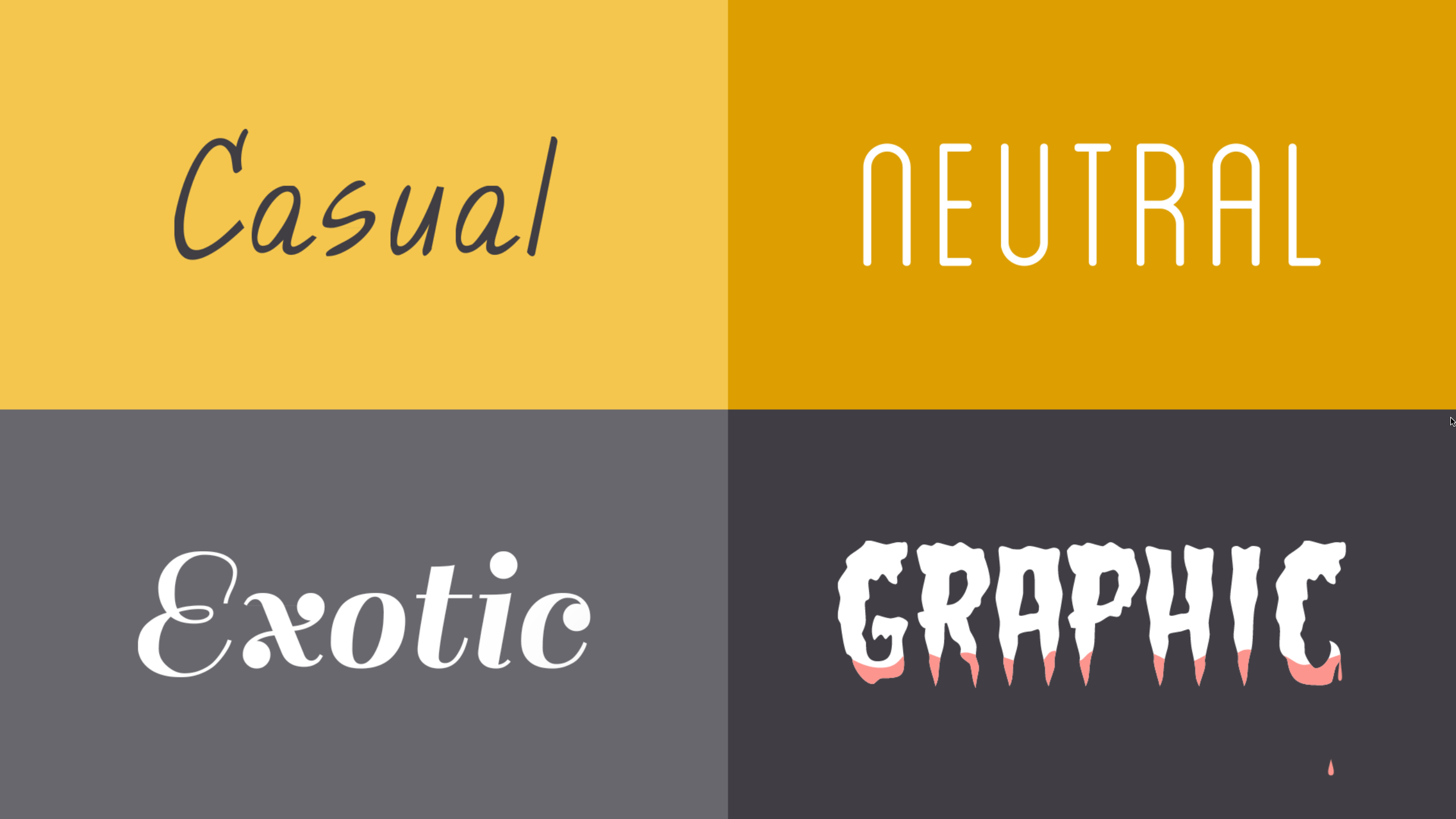
In a way, fonts have their own language. They all have something to say beyond the words on the page. They can come across as casual or neutral, exotic or graphic. That’s why it’s important to think about your message, then choose a font that fits.
Fonts to avoid
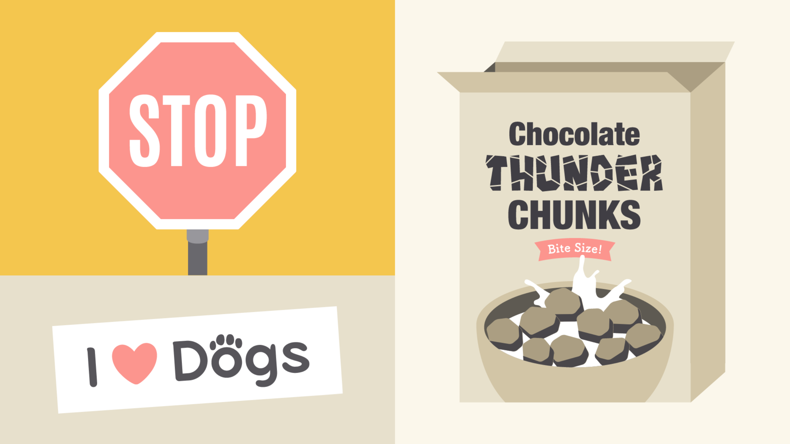
Some fonts come with extra baggage, including Comic Sans, Curlz, and Papyrus. There’s nothing particularly wrong with these fonts—they just have a certain reputation for being outdatedand overused.
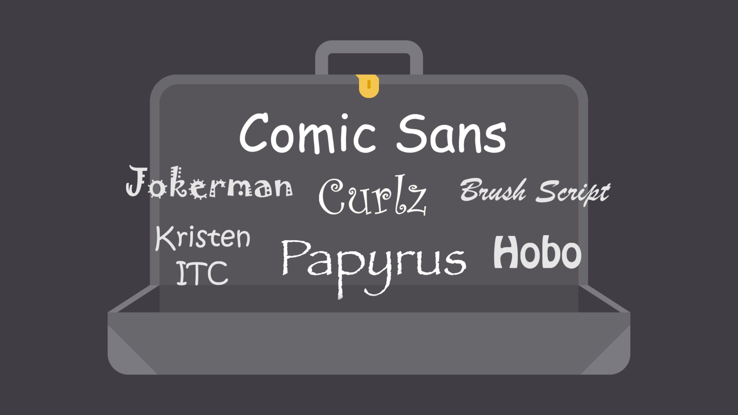
If you find yourself tempted by them, think twice and consider using something else. There are many fonts with a similar look and feel that are less likely to detract from your message.
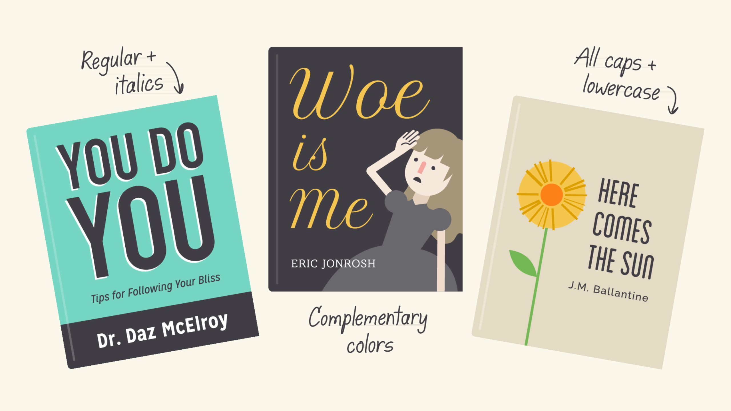
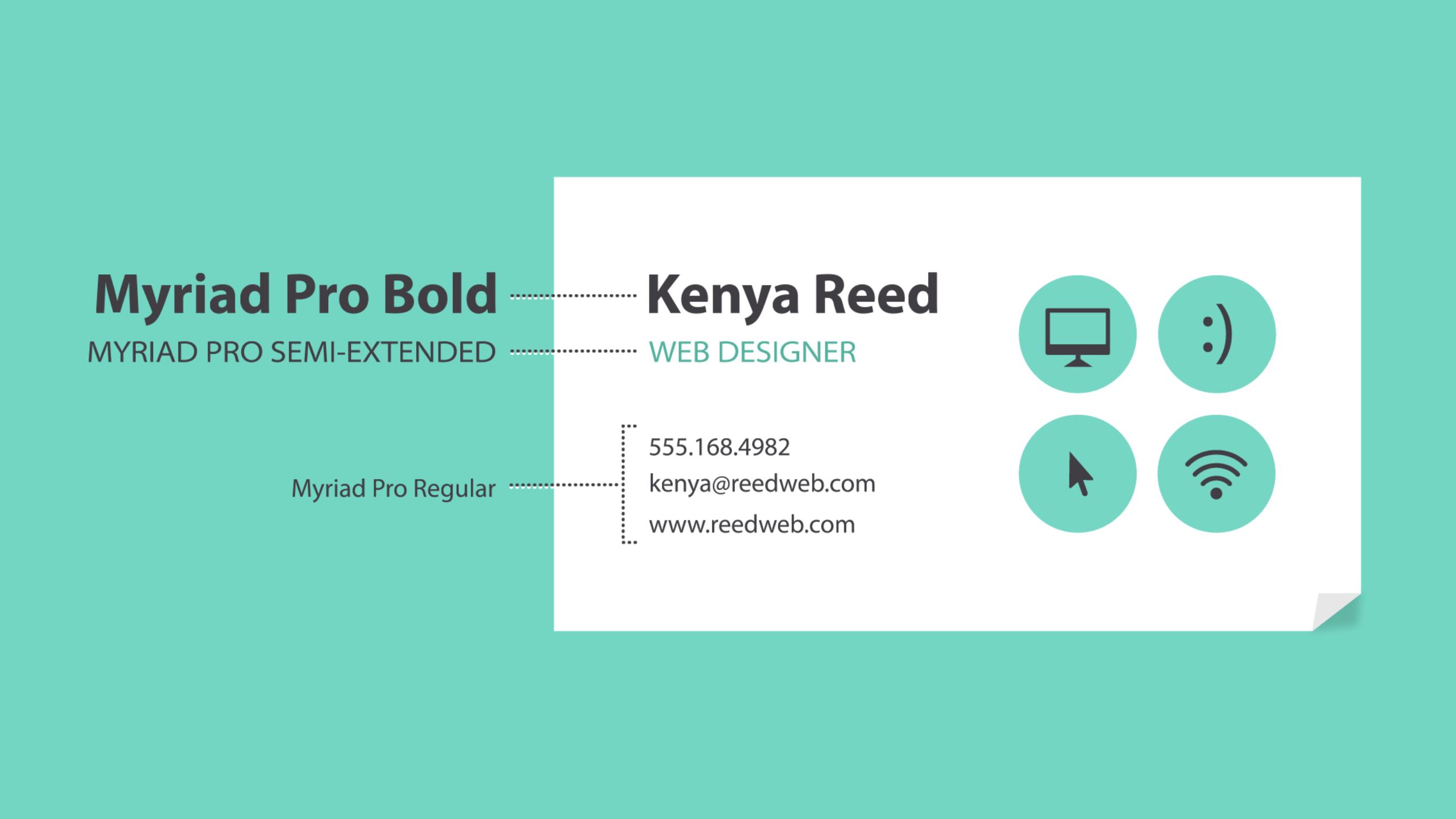
Combining fonts
When deciding which fonts to use, less is more. It’s best to limit yourself to one or two per project. If you need more contrast, try repeating one of your fonts in a different size, weight, or style. This trick is practically foolproof for creating interesting combinations that work.
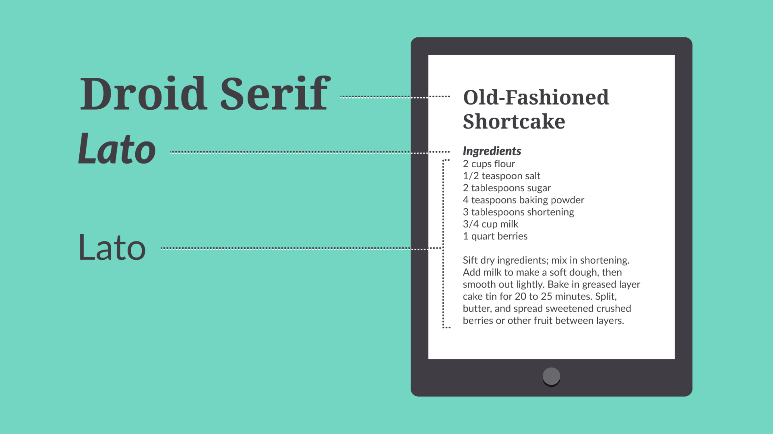
You’ve probably heard that opposites attract. The same is true for fonts. Don’t be afraid tocombine font styles that are different but complementary, like sans serif with serif, short with tall, or decorative with simple. This can be challenging at first, but don’t despair. Look to other designs for inspiration, and soon you’ll get the hang of it.
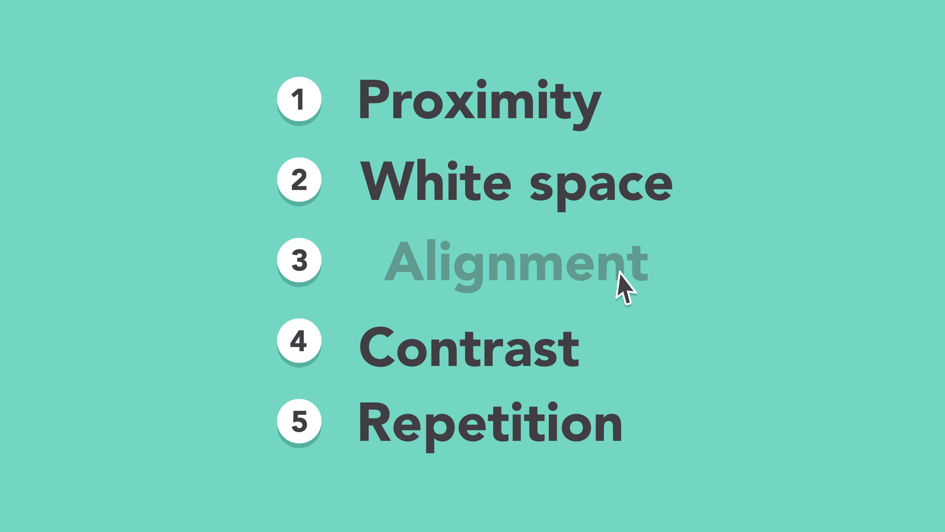
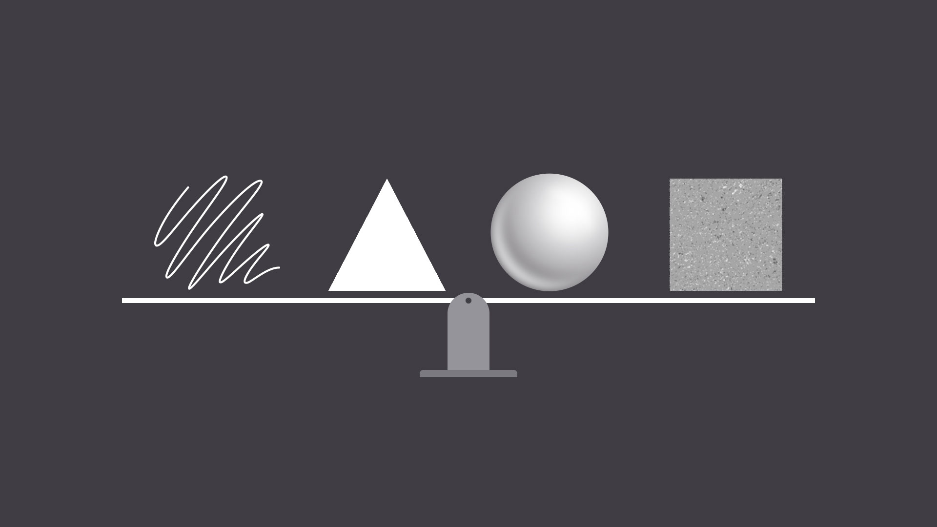
Other important terms
Maybe you’ve heard terms like kerning, leading, tracking, and hierarchy. For those with more experience, these concepts are essential for creating professional-looking designs. As a beginner, you don’t need to know everything about these terms—just enough to inform your work and help you talk about design with more confidence.
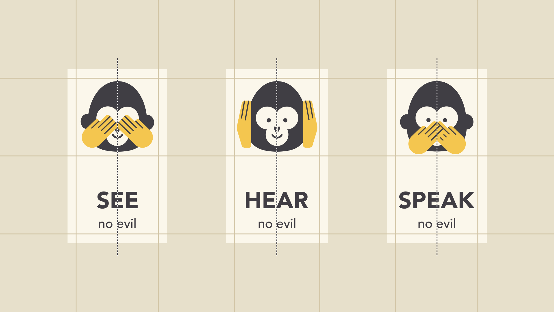
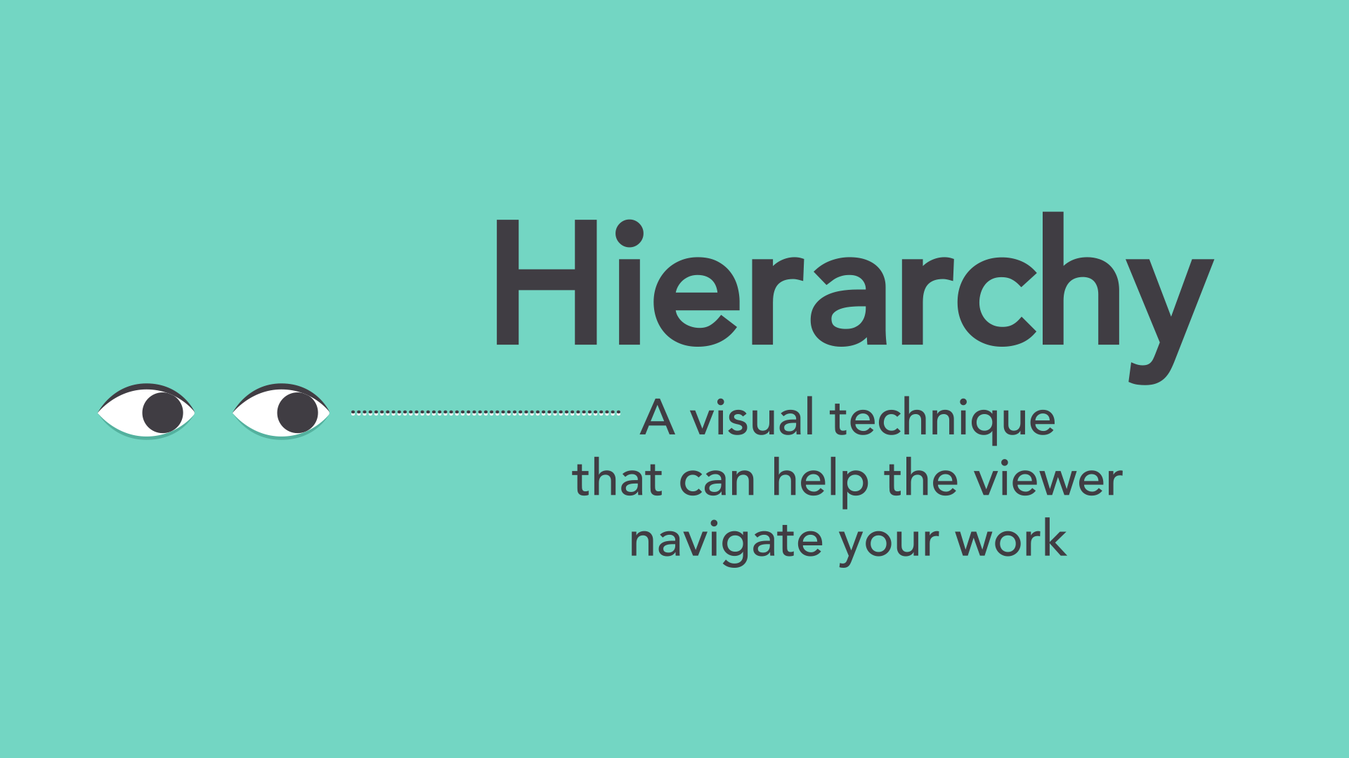
Hierarchy
Hierarchy is used to guide the reader’s eye to whatever is most important. In other words, it shows them where to begin and where to go next using different levels of emphasis.
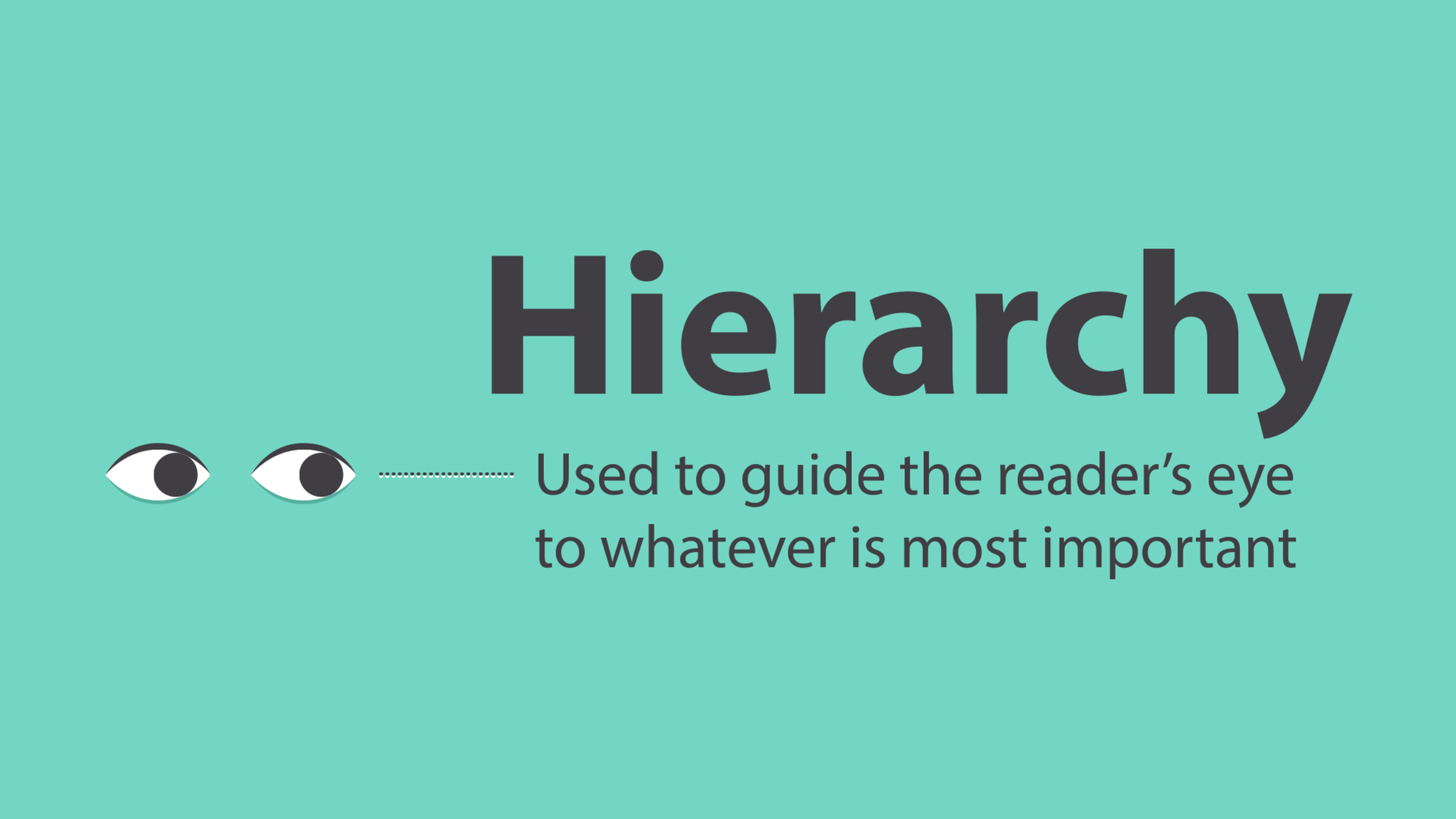
Establishing hierarchy is simple: Just decide which elements you want the reader to notice first, then make them stand out. High-level items are usually larger, bolder, or different in some way. Remember to keep it simple and stick to just a few complementary styles.
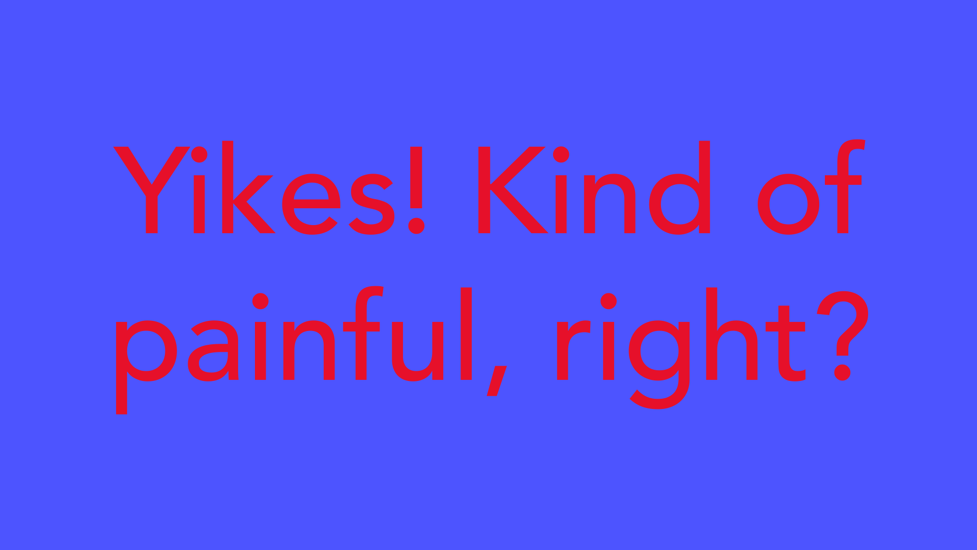
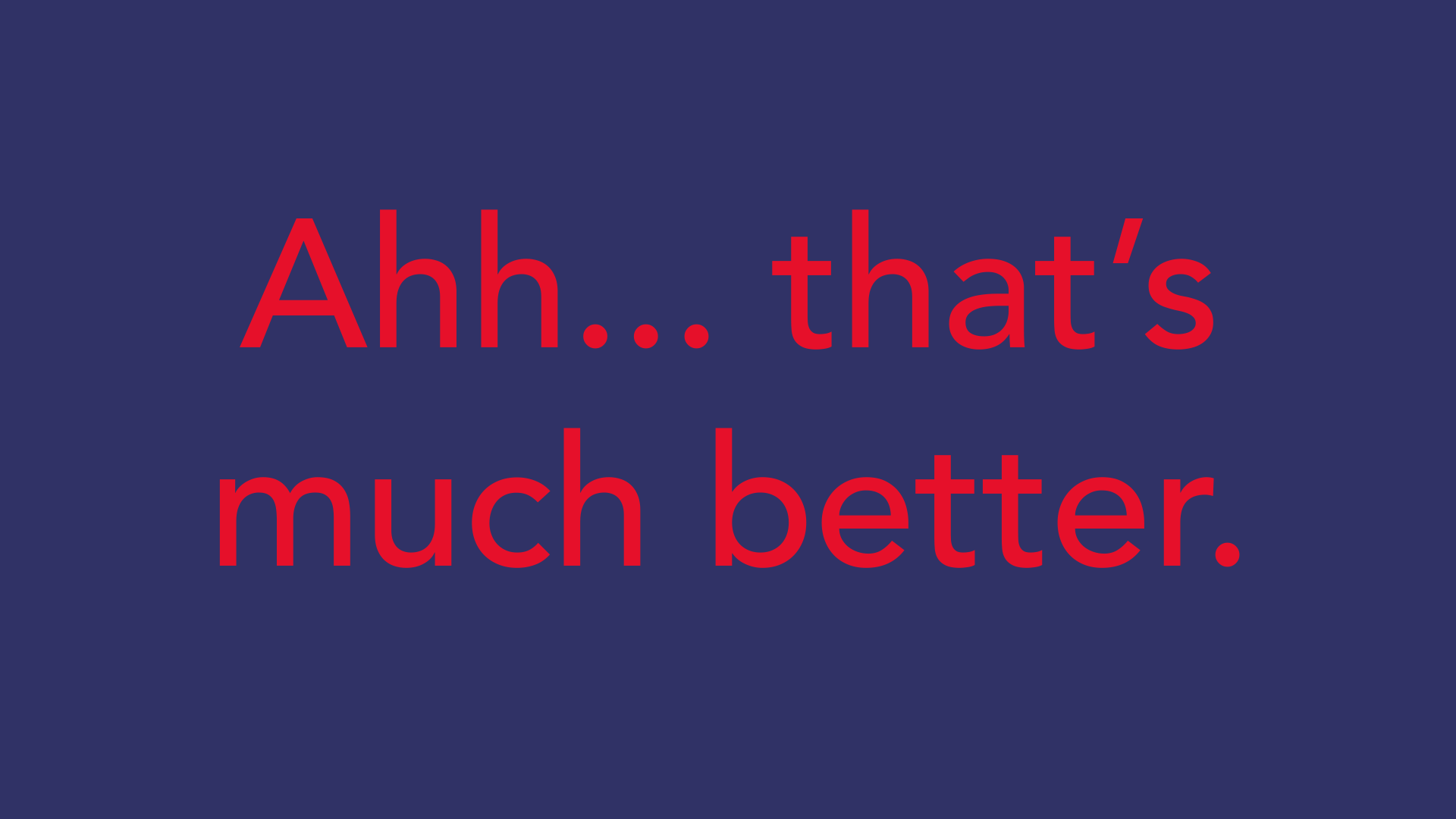
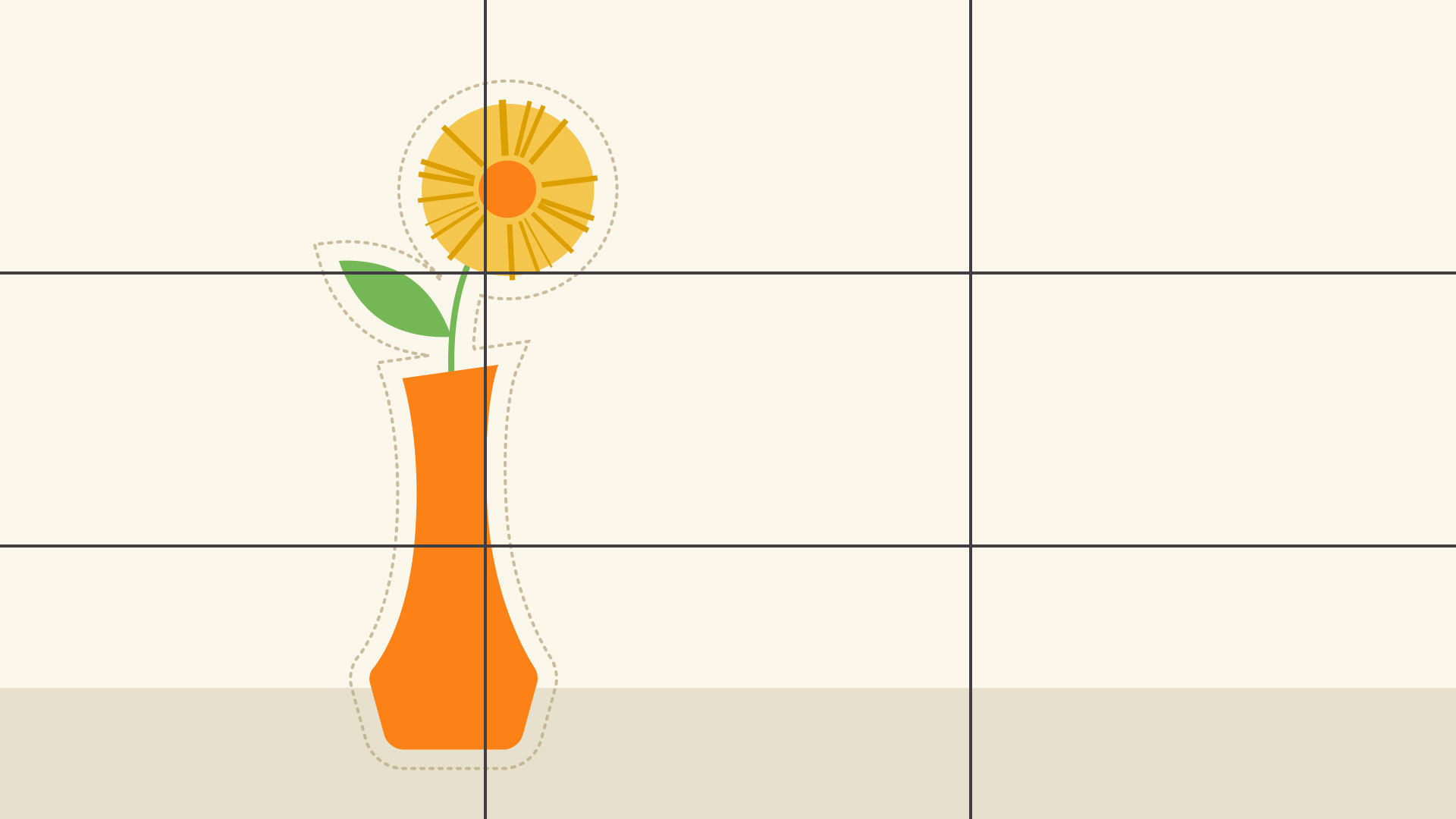
Leading
Leading (rhymes with wedding) is the space between lines of text, also known as line spacing.
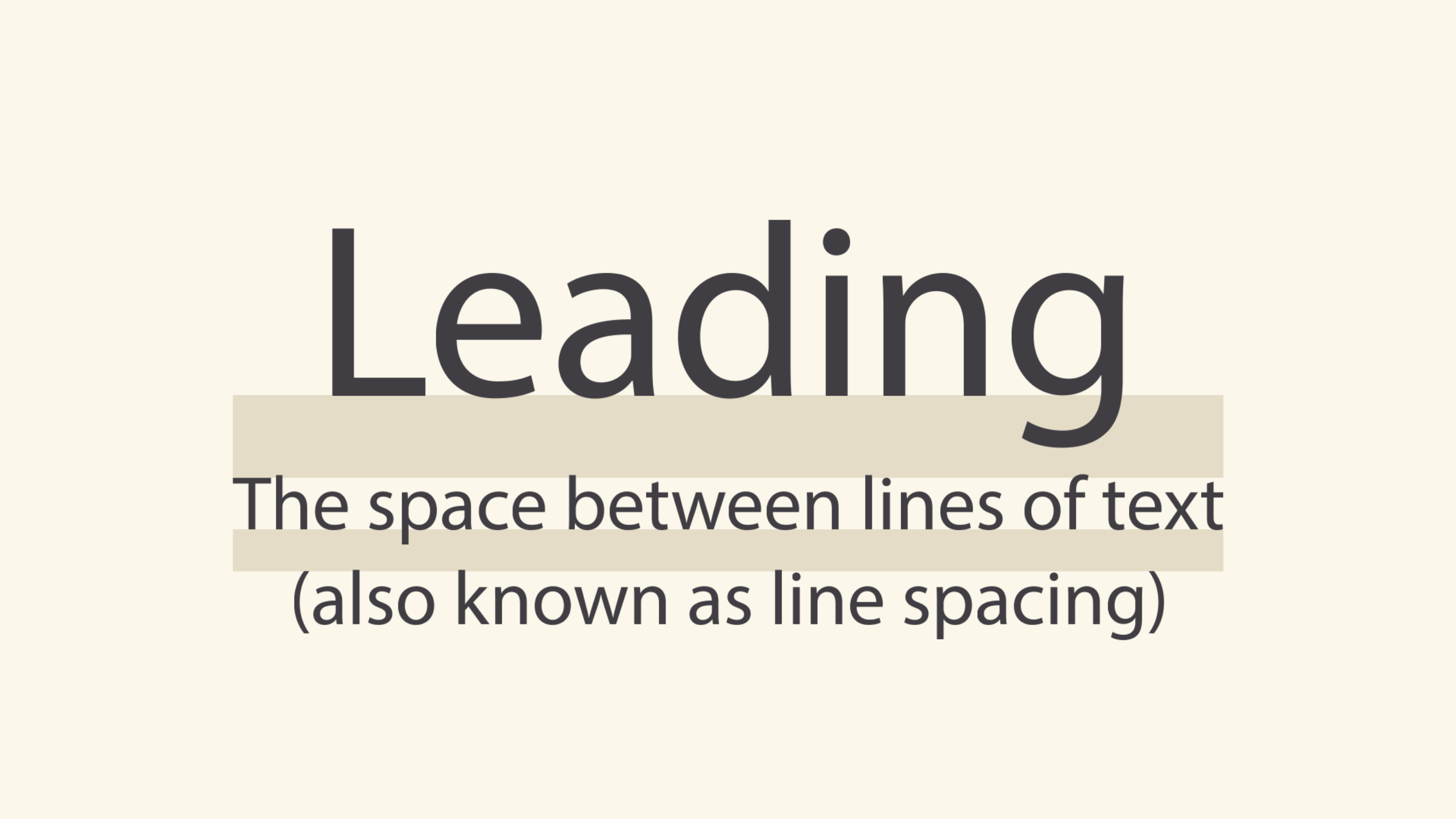
If you’re not sure how much line spacing to use, don’t fret—the default is usually fine. The goal is to make your text as comfortable to read as possible. Too much or too little spacing, as in the example below, can make things unpleasant for the reader.
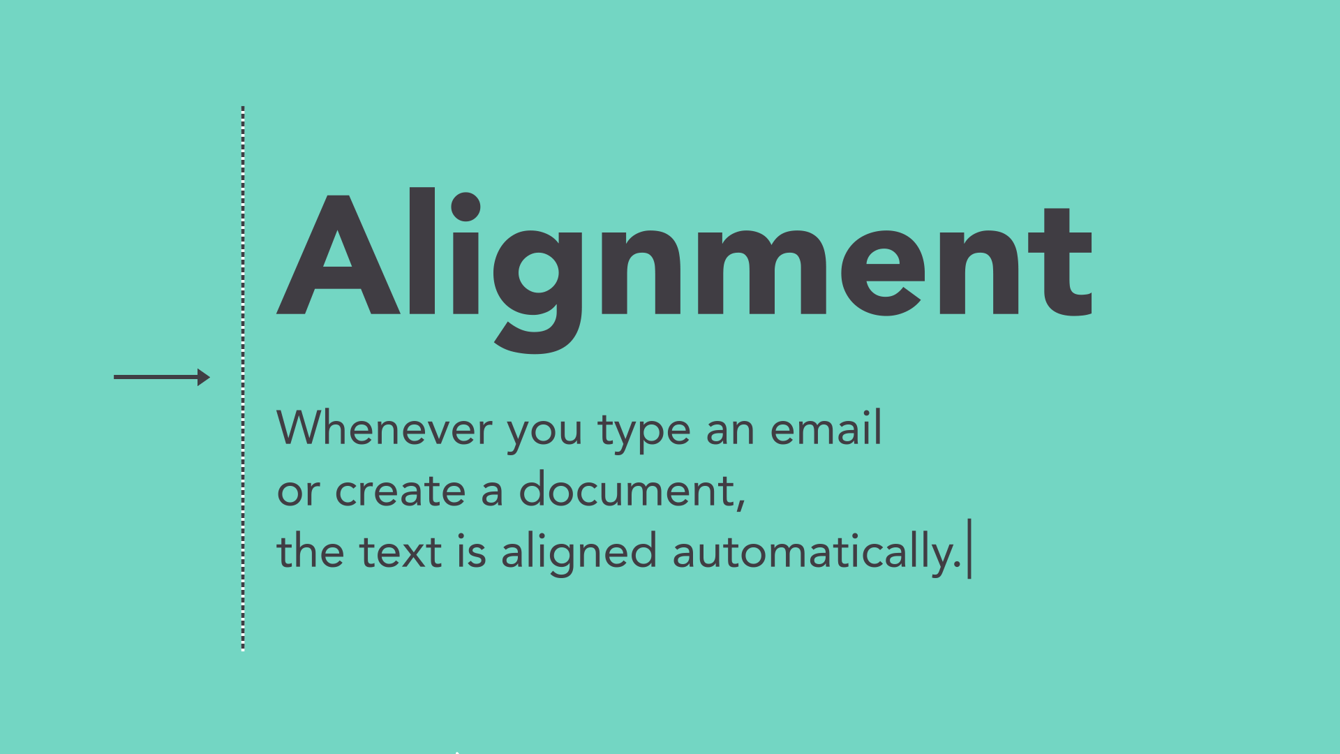
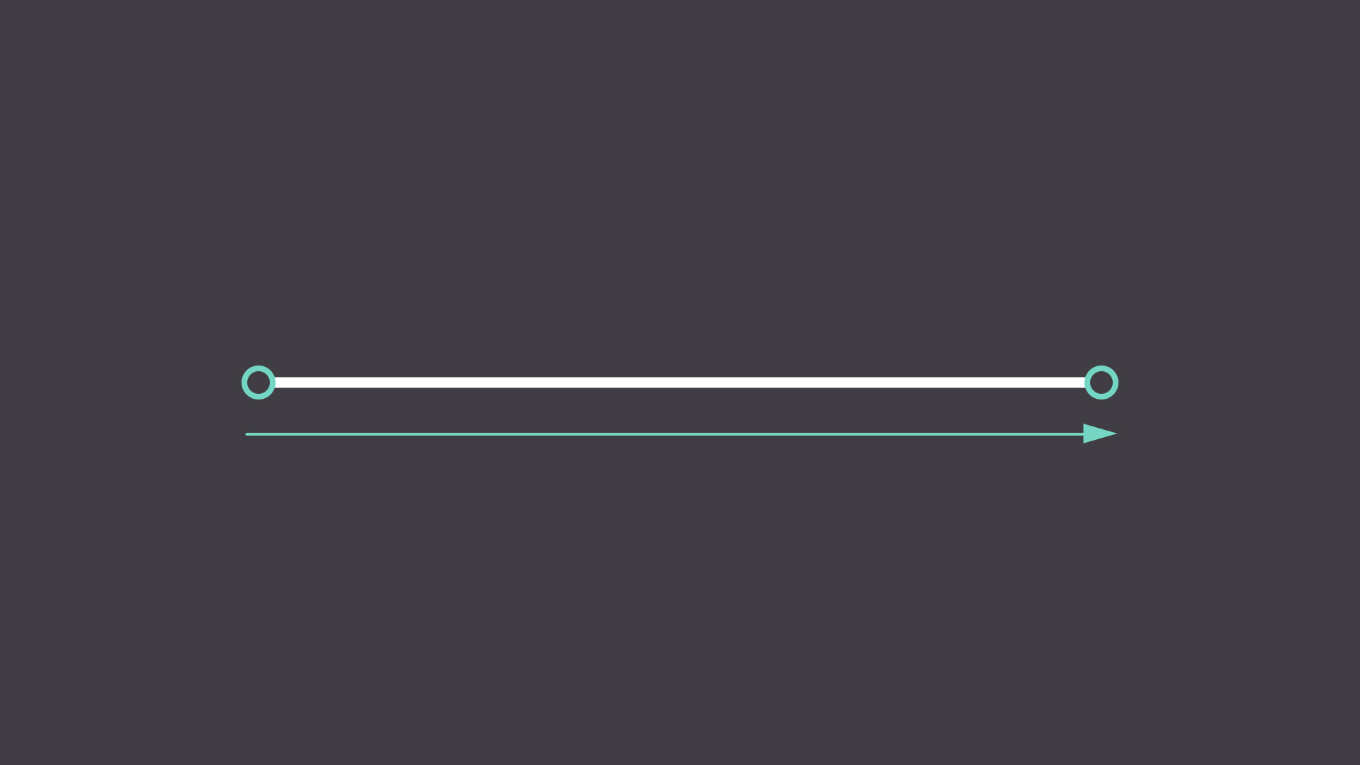
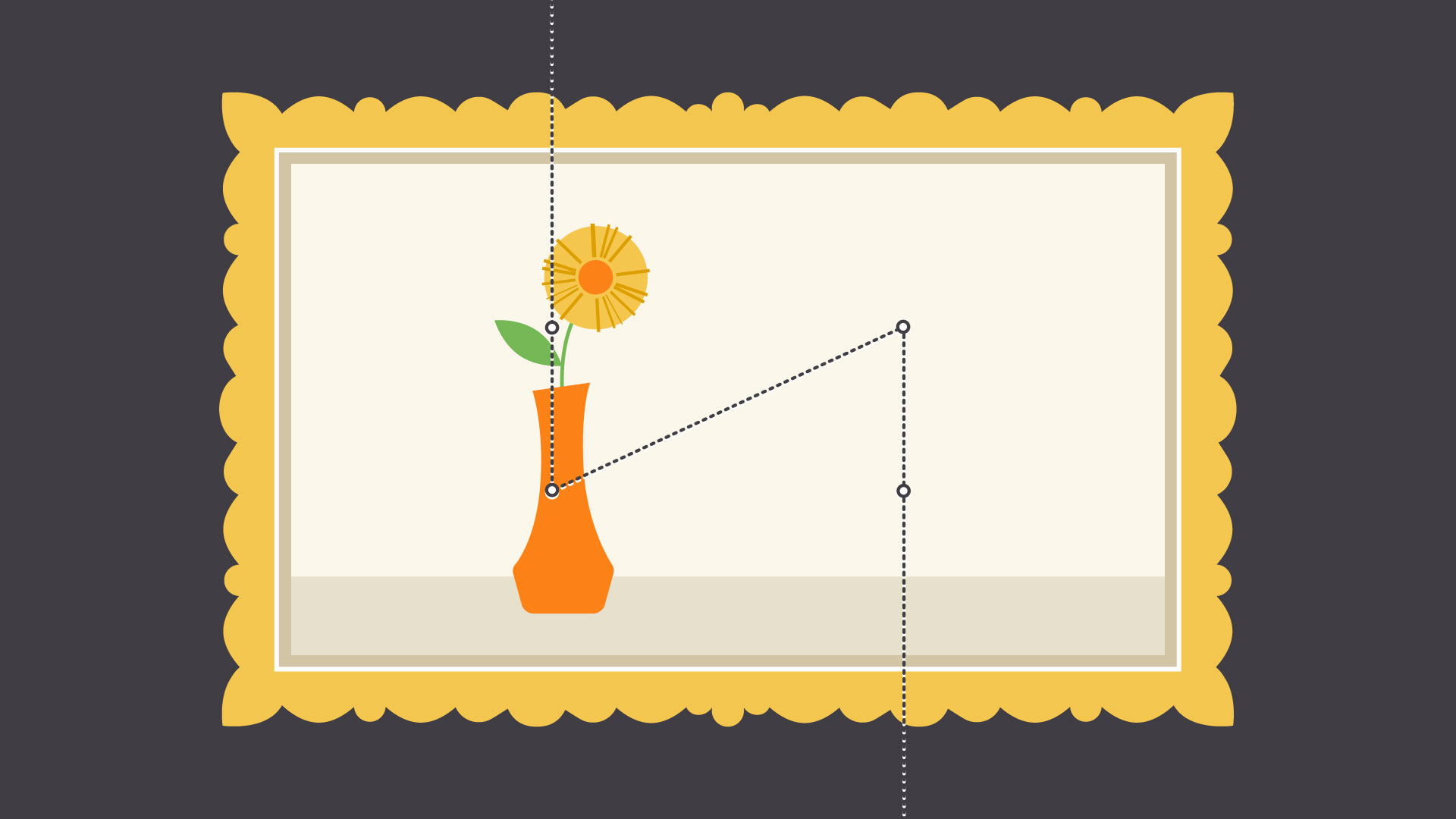
Tracking
Tracking is the overall space between characters, sometimes called character spacing. Most programs let you condense or expand this depending on your needs.
In some designs, you might adjust your tracking to create a certain artistic effect. It can also help you fix fonts that are poorly spaced to begin with.
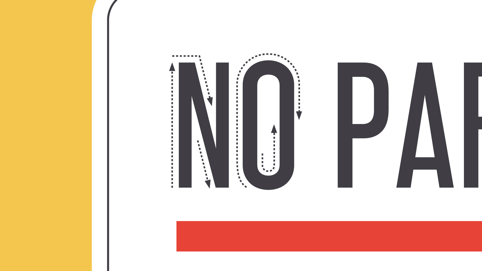
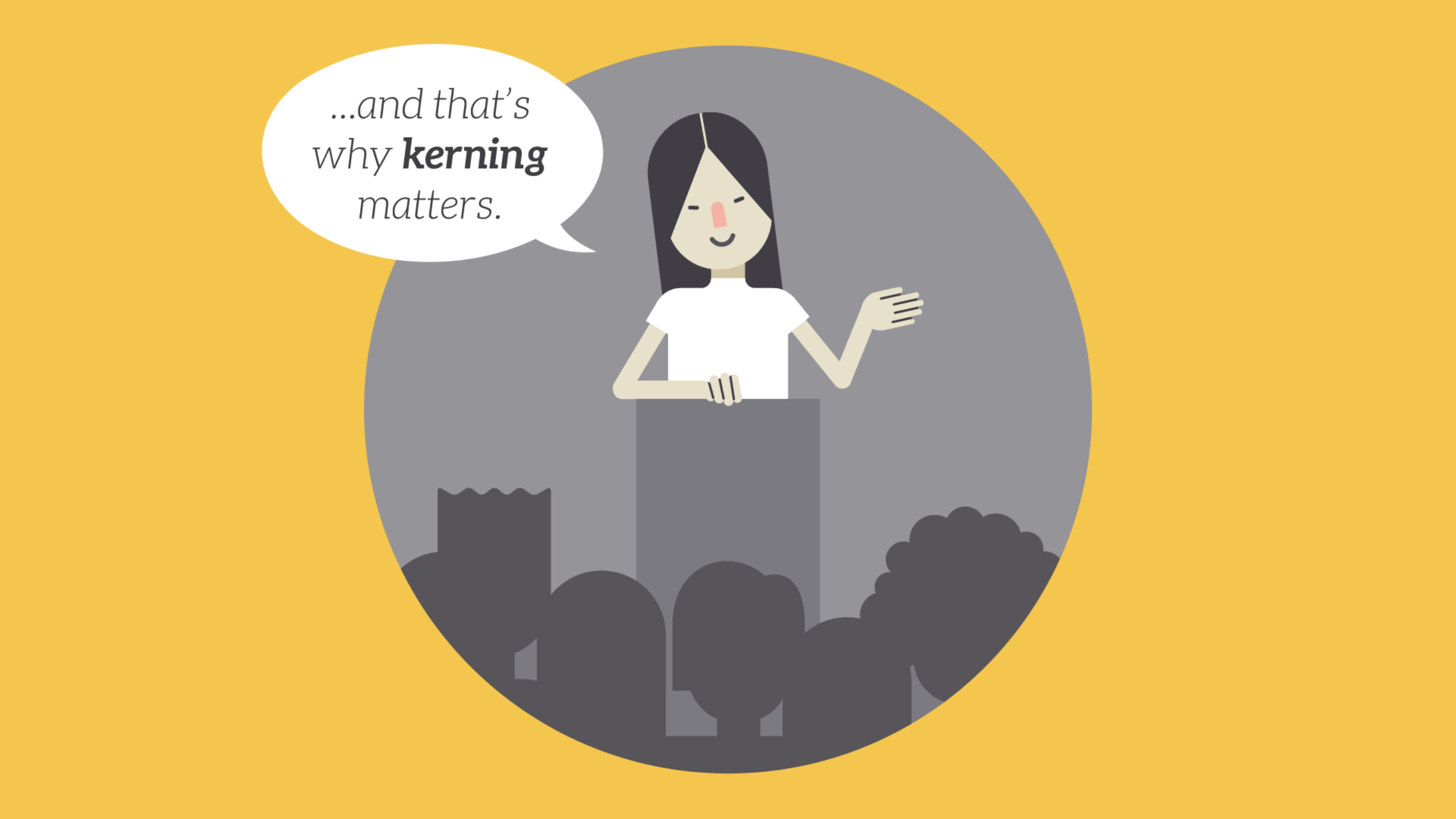
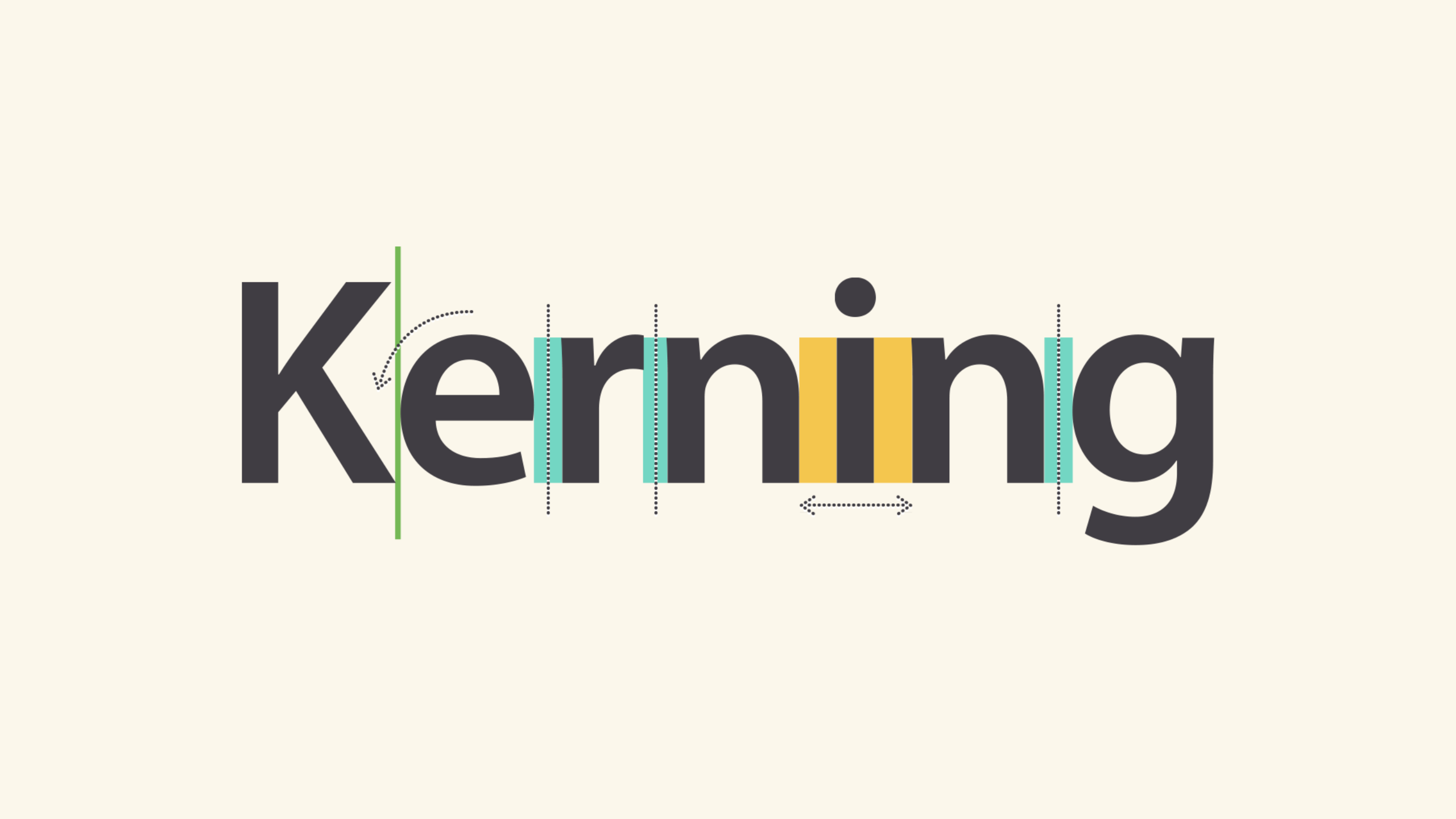
Kerning
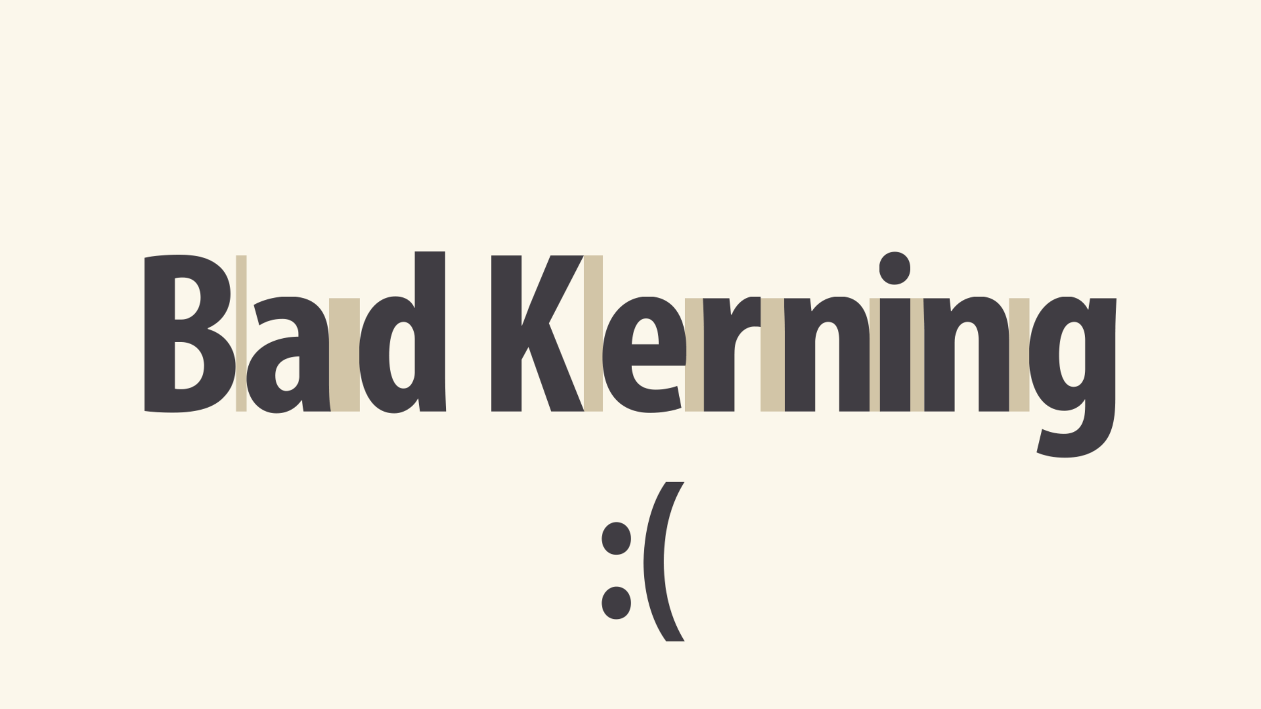
Kerning is the space between specific characters. Unlike tracking, it varies over the course of the word because each letter fits together differently.
Some fonts have what we call bad kerning, making certain letters look improperly spaced. If a font you’re using has bad kerning, it’s best to cut your losses and choose something else.
Putting it all together
Well-crafted text can mean the difference between something ordinary and something extraordinary—even if you’re just getting started with design. All it takes is an interest in typography and you’ll start to notice more, see more, and be able to do more in your own work.